Friday, May 31, 2013

A Plein Air Adventure

Last week, Clair Breetz,  my fellow studio mate from the Art Circle invited us to Ryland Lakes to paint plein air. It is a country club community, surrounded by cottages and summer homes.  It was so beautiful it qualified as bucolic.  I did a couple of plein air paintings, one of which, I'm showing the evolution of here. 

At the end of a long lake, sat a triangle house, nestled at the bottom of the hills and the edge of the lake.  Really.  Triangle.  And, it was framed in white.  On the left is my first attempt, and on the right is a second version.


I like the sky, and I like the water.  The middle section?  Not so much.  That house looks out of place, and where the shore meets the tree line is under defined and washed out.

What to do?  I went back in and weighted the shore line with darker colors.  When I rephotographed the painting, you can still see the house.  That is a powerful triangle.  (The inconsistent blues of the sky have more to do with my photography skills.  I'm working on it, but watercolors can be challenging to photograph, in my opinion.  See here.)


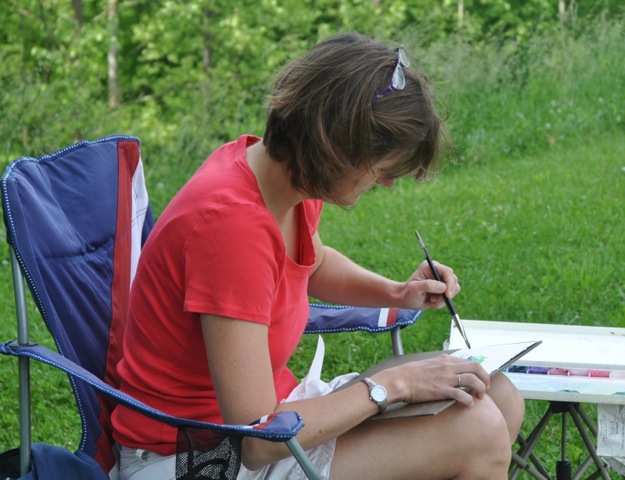
And, here's a picture of me painting the 1st version, taken by my +Connie Springer , who does lovely portrait photography.

Tuesday, May 21, 2013

Revisting a Failed Painting

A couple of weeks ago, I posted about a painting I tried to put together from my memory and a thumbnail sketch.  You can read that post here.  I just got back around to trying it today, and here's what happened:

You can see I've made composition more consistent with the thumbnail sketch, which improves the painting.  I've also restricted the palette (5 colors:  indian yellow, ultramarine blue, carbazole violet, manganese blue hue, and burnt umber).  Finally, for the most part, all the colors are unified across the painting, and the indian yellow is left for intensity.  The painting is also much larger--about 14x14 inches. 

Does it convey the feeling I was shooting for?  Well, no.  It makes me think of winter rather than spring.  But, overall, it's an improvement over the first attempt.

Monday, May 13, 2013

Photographing Watercolors

If you ever want to try an exercise in frustration, try photographing watercolors.  The frustration level ramps up if you are stacking the colors in the painting (ie, transparent layers) or using intense colors that are close in value.  Take for example the following painting I tried, which has the following Daniel Smith colors: phthalo Blue, phthalo green, quinacrodone violet, carbazole violet, and permanent yellow deep.  The emphasis was on shape and hue (or color), so I tried to de-emphasize value. 


The picture on the right shows how close the values in the painting are.  There is some variation, but there it is small across the painting.  The picture on the right shows an attempt at getting the color correct.  I really like the painting to look at, but the photograph of the painting?  Not so much.  It should be much more uniformly--teal?  I'll keep trying to work out how to get an image that accurately represents the painting.


Tuesday, May 7, 2013

A Failed Painting....Try and Try Again

I was driving my boys home from a lacrosse match south of Dayton when we happened upon a tree lined field.  It was late in the afternoon, and the trees were casting long shadows that looked like fingers.  I love landscapes like this.  I stopped and gawped.  My boys wondered what the hold up was.  I tried later to do a thumbnail sketch to lay out the composition, like so:

The tree shadows were an grayed down ultramarine blue, and the trees and sky were about the same value in blues, greens and golds.  Since it was early spring, you could clearly see the tree branches, and the field tended toward a brown and gold.

I did not take a picture.   A thumbnail sketch and my memory is all I've got to work from for composition.   For more on thumbnail sketches, you can read here.
The painting did not come out at all like I planned....I need to go back and try again and adjust the colors and shapes.  Try and try again.

You'll notice, I've been repeating paintings--frequently it's for scale.  I'll experiment small and then scale up if I like the small work, or the study.  Or, it could be to fix issues like shape and color.  When I'm working from my imagination it can be hard to strike the right balance the first time out.  You can see that when you compare the paintings here and here.

Hopefully, next week, I'll be able to show you an improved version of the same landscape.